Erik Mark Sandberg is an LA-based artist whose subjects are shrouded in hair, growing it in all places where it shouldn’t be. His distinct painting style is continuously evolving, using various printing techniques and painting applications, expanding the definition of traditional fine art. His second and most recent solo show, Down by the River, at Berlin’s Johansson Gallery at the Direktorenhaus, depicts hairy, neon-coloured adolescents which evoke questions of acceptance, beauty, and contemporary pop culture. In between teaching at Art Center Pasadena and OTIS College, Erik has taken the time to chat to us about his work…
Your latest body of work, Down By The River, continues to explore the negative impacts of mass culture on young people, and features illustrations as well as sculptures. Can you take us through your design process for this exhibition?
Sure, Down by the River was my second solo exhibition in Berlin, the first being back in 2010. The exhibition space this time was at the Direktorenhaus, a three-storey 1935 building located in central Berlin. Formerly the building was used as an art safe house during the bombings of World War II, as well as a currency mint.
The show explored the relationship between projected idealised archetypes and the unattainable emulation of them, along with some investigations into simulacra, and contemporary social environments. The symbolist figures have been aged in the show and are processing their new environments. The title is loosely based on the folk tradition of unsupervised coming of age senior camping trips ending up in drunken debauchery outside the gaze of parental authority.
How is this collection of work a further exploration of your ideas?
The visual figuration is changing due to exciting new and compounding cultural pressures. These include references to contemporary branding techniques, societal competition, social environments, contemporary sexual identities, etc.
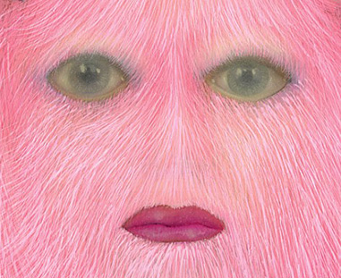
Illustrating people with a hairy-like quality is a running thread in your work as can be seen in your Hairy Children portraits. Where did this particular idea come from and what does it symbolise?
The genesis of the hirsutism portraits started in 2008. The hair started off in a broad sense to be a metaphorical vehicle for effects of populace consumer culture, idol worship, emulation of celebrity, etc.…. it’s the paradox of the obese girl who was simultaneously a victim of fast food marketing and sexualised teen fashion. In a way the portraits are a depiction of reverse Darwinism.
The portrait titles are very banal like clothing catalog descriptions, the intent was to have the paintings be more symbolic then actual characters while trying to minimise narrative overtones.
The paintings I was making before the portraits were narrative in nature and everything was external. In the portraits, everything I was painting before got internalised into psychological space.
Living in LA you must see everyday examples of how contemporary pop culture affects young people, is this right? Do you think it affected you as a child?
Of course, I grew up in a middle class, all-American, Midwestern suburb in the ‘80s. Track homes filled with kids intoxicated with MTV, HBO, Disney, neon, WWF, and Heavy Metal music, I loved it.
Living in Los Angeles now I’ve observed the Los Angeles youth to be super media savvy, I think to grow up in this town it’s natural. Everyone I know here in LA is somehow connected to that industry by some degree or another.
You also use bright, fluorescent colours in your work. How does this contribute to the ideas you are trying to communicate?
I think the razzle-dazzle effects of consumer culture can become hypnotic between flashing web banners, billboards, and the glowing lure of cheap jewellery cases. The colour choices come mostly from spontaneous intuitive decisions, others are for conceptual reinforcement. Neon colours are very artificial, they’re exotic, and live outside of the normal spectrum. Fluorescent colours have a quality that is manufactured and tend to be used at car dealerships and rug store windows communicating an important going out-of-business sale, garishly trying to command attention. Also there is a familiarity that comes with being a kid growing up in the ‘80s. I feel comfortable with that palette.
Could you take us through how you go about creating a particular piece of work? Your process, kinds of materials you use etc.
It usually starts with something, an idea I find interesting. Whether it’s a story in the news, a dysfunctional family I see trying to navigate the weekend trip to the mall, a picture, things that stick out to me in observations of daily life. After I have an idea, it’s more of a grappling of material choices. It becomes a constant push and pull, edit, rework….find some sort of sense of communication I’m settled with.
How did your style develop? Who or what has influenced your work?
It developed intuitively at first through material experiments. I previously studied 3D animation and creation, and auto body painting and repair before studying fine art. When going to execute ideas, those material vernaculars naturally made it into the work. Conceptually the immortal industrial sculptural materials felt like they worked well, much like an oversized Burger King toy.
Being a freelance artist what is your day-to-day routine like?
Anything but routine, I contracted an unhealthy case of insomnia 10 years upon graduating from Art Center College of Design, and the late night Starbucks injection doesn’t seem to be helping it very much. I’m a senior lecturer at the University in the Fall and Spring which helps remind me what sunlight is. I do get into the studio everyday whether to do research, construct, paint, read, or watch Stargate on Netflix. I figure as long as I’m there something will eventually start to happen.
In a previous interview you mention that you don’t feel like what you do is ‘work’? Has it always been important for you to pursue something creatively fulfilling?
It seems the most natural, I worked in print and advertising upon graduation from art school and loved it for a while, then the context of the work needed to change. Fortunately around that time I was able to do a show in 2008 in NY at The Jonathan Levine Gallery titled The Equilibrium of Glamour and found more appropriate context for the work I was creating at that time.
You were in Melbourne last August for a residency. Did you get up to much while you were here?
Yes, working in Melbourne all of last winter was one of the most rewarding experiences personally and professionally. The artistic community is really smart, and socially, all the openings were packed and everyone was genuinely enjoying themselves to the early hours of the morning.
RMIT, who hosted me, were beyond accommodating on every level. My solo residency coincided with a group printmaking residency where I got to work with Aboriginal artist, Graham Badari, and study some turn-of-the-century bark paintings at the Melbourne Museum. The bark paintings and artefacts were from his village in Injalak Hill, Gunbalanya, in the Northern Territory. It was fascinating to hear all the authentic cultural motivations behind the works. At the end of my residency I trained up to Sydney and found it to be one of my favourite cities in the world.
What are your plans for this year?
Currently working on a few larger sculptural works, and some short personal art films, which I’m experimenting with making costumes, designing backdrops, projection systems etc. I’m not formally trained as a filmmaker so I’m approaching it a bit like a painter. I figure it is a natural medium for my current ideas, also my studio is ten minutes away from Hollywood Blvd and making art films in the shadow of the Hollywood sign seems appropriate.
Erik Sandberg online:
Interview by Christine Miralles and Rebecca Vaughn