
Blending Bauhaus and Gothic, Tristan Kerr crafts a Meisterpiece Jägermeister asked Tristan to reimagine their label. He obliged.
Art

Earlier this year, Tristan Kerr was tapped by Jägermeister for their Meisterpieces project; an ongoing series which sees hands-on makers craft works inspired by the spirit’s German heritage. We’ve been fans of Tristan long before he made his ‘Meisterpiece’, and wanted to hear more about how the typographer and painter got his start.
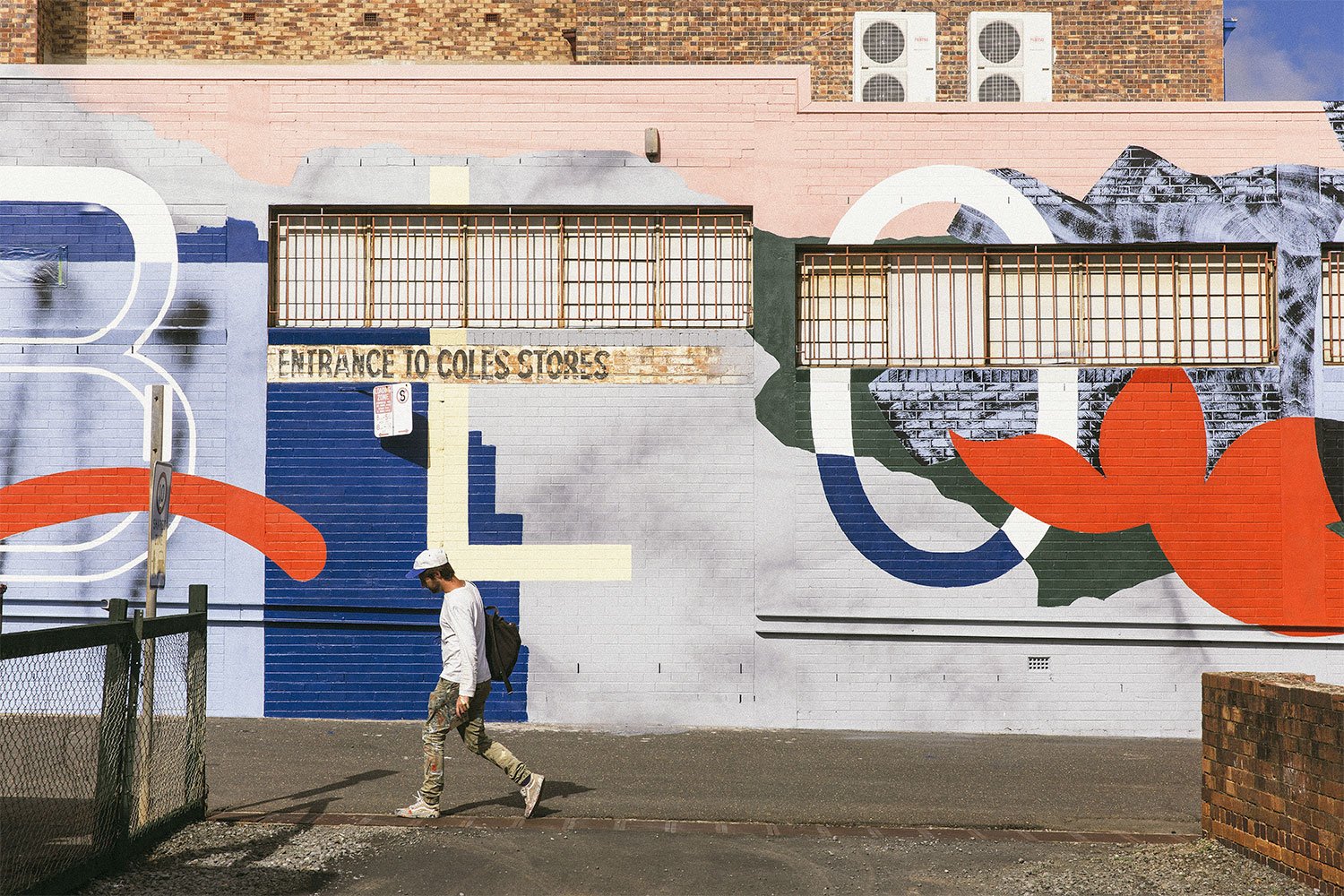
By his own admission, artist and typographer Tristan Kerr is quick to evolve. It’s his nature to leap between disciplines; between canvas and pavement. His graphic, vivid murals examine our relationship to public space, incorporating elements of sign writing and graffiti, skills gleaned from time spent working in Switzerland and Paris. Now settled back in Melbourne, Tristan’s applying his knowledge of traditional sign writing to walls country wide—though he’s not averse to modernising some cardinal rules.
Your practise spans a few mediums—signwriting, large-scale murals, and works on canvas. I’m interested to learn which medium you began with.
A few years back, I lived and worked in Paris. I was employed by a design studio which focused on graphic design and illustration, mostly for high-end Parisian fashion brands. Being based in Paris helped me discover a number of other typographers, graffiti writers, screen-printers, and sign-painters. That definitely inspired my work and gave me the motivation to pursue a career as a multi-disciplinary artist. I think the experience of living in a bustling city opened my eyes to the visual dialogue of mark making around the urban landscape—a dialogue between sign and graffiti writers, council buffers, and consumerism. I also spent the good part of a year working in Switzerland for a traditional screen-printer who had a vast knowledge of Swiss type and hand lettering. Seeing his artwork and brush skills really inspired me to pursue a career around typography. I think the resurgence of sign painting and lettering is incredible. I feel like I should continue to help celebrate it as a craft, while honouring the old sign-painters who cut their teeth on hard and repetitive work. I feel there’s something really significant and valuable worth holding onto these art forms.

Along the same lines of balancing the old and new, how do you find yourself juggling disciplines today?
My work seems to change and evolve at a quicker rate compared to other artists—I’m not sure if this is a good thing or not. I guess it reflects my personality and hunger to learn, to try new approaches. I’m not really consumed by whether or not my work slots into one format. I see value in art when you can engage with it at different levels. It frustrates me how, as humans, we naturally need to label or put things into boxes. Saying you’re a ‘street artist’, ‘graphic designer’ or ‘abstract painter’ makes it easier for some people to get their head around it, but ultimately, you’re just creating.
How do you negotiate making impactful and graphic work without, in a sense, intruding on public space? How deeply do the buildings and neighbourhoods you’re presented with influence your site-specific work? Or is it more a matter of the inverse: searching for the right canvas to realise an idea?
The opportunities are usually presented to me, then I’ll work with the community or dig up some research that helps inform the finished piece. I think it’s important that the work relates directly with the surrounding environment for it to be successful, otherwise it may as well be a billboard or advertisement. My work is always inspired by my urban surroundings, so a lot of inspiration I find in words comes from text I see in the streets or an idea inspired by the neighbourhood itself. I like the interpretive qualities around art. I like the words in my work to communicate an idea about what I’m creating, without being too literal.

I’m really interested in your murals on pavement, and how these wear away with foot traffic. How does that accelerated rate of decay factor into your process?
Working on the ground poses physical challenges, along with perspective and durability. The application with street-paint is different: it’s designed to withstand the elements, so it’s a lot denser and heavier than normal paint. This meant simplifying the design so it could be applied properly. I also feel indifferent about whether it will fade with foot traffic or not. Any work within the public realm generally has a lifespan and faces its own challenges due to capitalism and gentrification.
Regarding more commercial projects, do you still feel a sense of ownership over the work, or is it entirely the brand’s?
My visual artwork has always sat alongside my commercial design work. In the past twelve months, I’ve launched a new venture under Uppercase Studio to separate my increasingly diverse practice in design and typography, where I solely work on type-based branding and font designs. In this regard, it’s purely and unemotionally for the client. In recent years, I felt that it was becoming increasingly more important for me to separate my commercial and artist work. I think overall it helps me present my work better, rather than a cluster fuck of everything. Moving between these two worlds often keeps me feeling sane, and keeps things fresh.
Watch Tristan craft his original ‘Miesterpiece’ below.